


0 Comments
|
I will admit to not always being an incredibly consistent person when it comes to doing things I enjoy. From years and years of playing soccer I have come to realize that the emotion that draws true consistency out of me is fear, not enjoyment, and that can lead to me allowing things that I actually really love to suddenly become challenging to wrap my mind around. So, it is not personally surprising to find myself struggling with making art that I feel comfortable with and proud of when that is the only thing being asked of me.
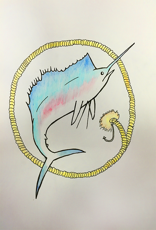
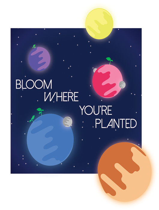
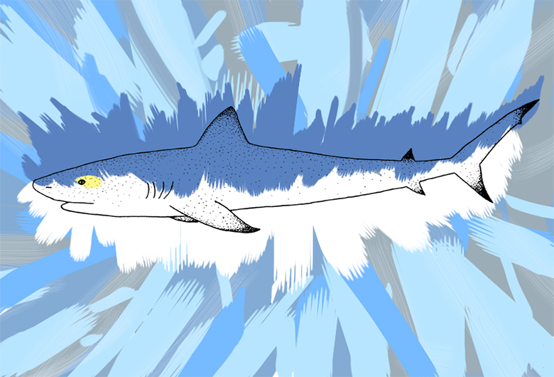
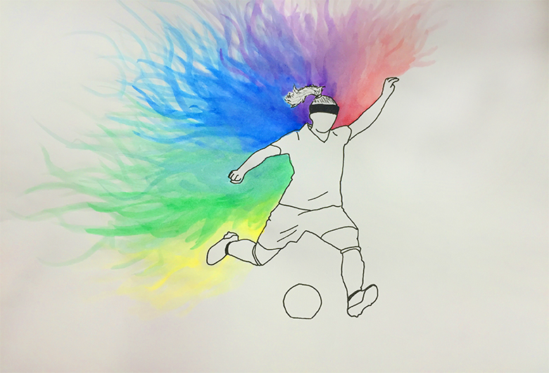
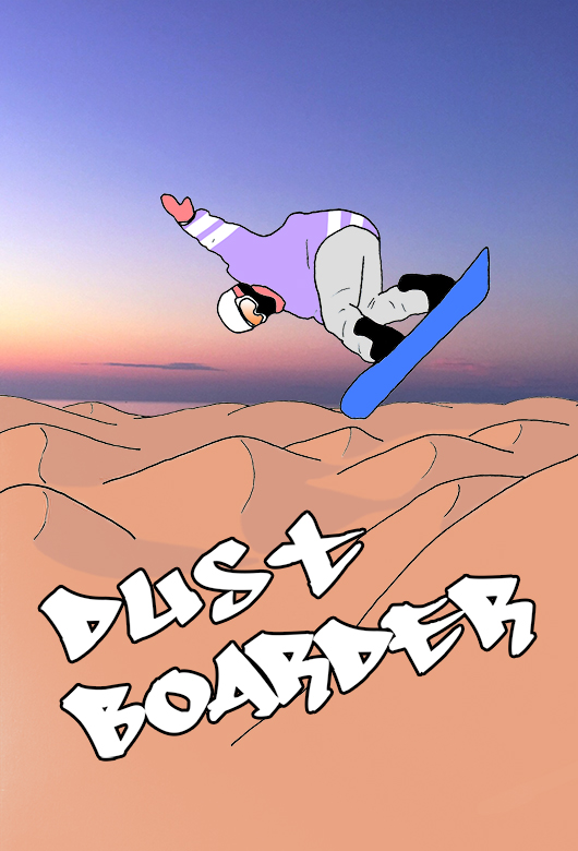
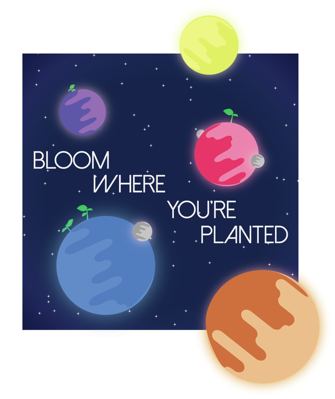
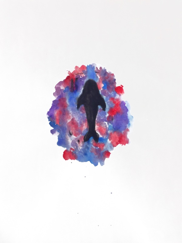
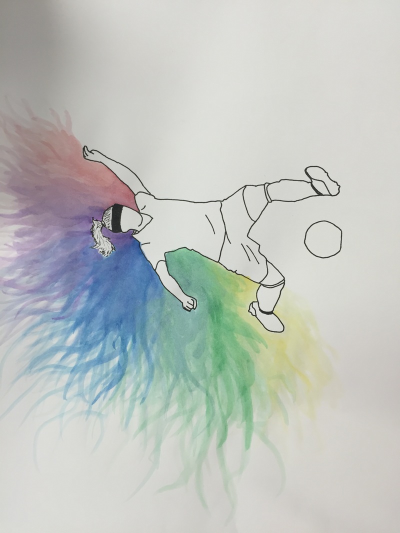
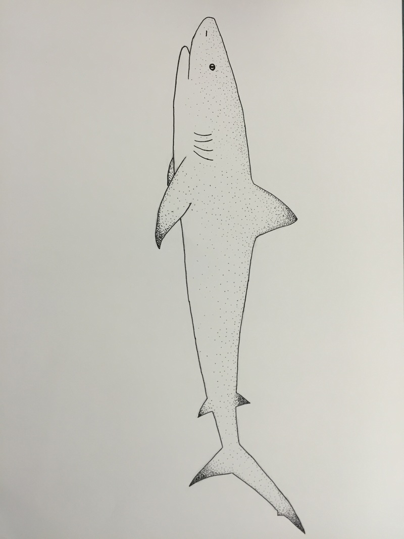
When I read the article about the 10 mistakes I could potentially be making as a fledging artist, I ticked the numbers off on my hand. Slowness of execution, lack of originality, and oversimplification are all crimes that I am guilty of. I overthink minor details of my assignments, have very little actual applicable skill in physical mediums, and give up mid-process on pieces that probably wouldn't be half bad if they could just finish themselves. I'm aware of it. The unfinished shark picture in my gallery is proof even if I wasn't. I have a terrible time of creating anything close to a background in an actual drawing, let alone producing a drawing that is worthy of being redefined in anything other than Number 2 pencil. I struggle to think of new ideas out of nothing and usually end up returning to the same subject matter over and over again. But, ironically, I'm not all that bothered by this. I've come to the understanding that the motivator I require and hate the most is rising up just in time for me to hit the ground running: fear. I have to submit something to the AP graders, so the added pressure of that deadline closing in will probably force me to do something worthwhile. Multiple somethings, hopefully. And, who knows? Maybe working on conjunction with Gretta on our side project will bolster my creative reserves. For the time being, I will work to fix the mistakes I have been making with my art directly, rather than consciously allowing them to happen out of the assumption that they are inevitable. The article suggested that I not take so long agonizing over the tiniest details of what I'm working on and to move with greater speed. It took me a full two weeks to finish Bloom Where You're Planted when I finished the sticker sheet in about four days. The disconnect between those two different working speeds needs to be leveled out. If I can reach a steady median, I should be able to be at least slightly more consistent, and that will hopefully make the entire process easier. And, thus, my reflection. Our freedom of expression is often limited by the society around us. Societal and cultural norms often dictate what is ‘acceptable’ for one to do and say. One specific norm that seriously influenced my choice of theme for my piece was the idea that men’s sports and intrinsically better than women’s sports. As a female soccer player who practices with boys, I have seen the insidious effect that this internalized belief can have on both boys and girls. Boys will put down female players, maintain the attitude that we are nothing to take seriously, while simultaneously being doubly harsh on any mistake we make. To make matters worse, female players often believe that they are somehow lesser than their male counterparts. “Boys are just better”, they say. But I find that to be such a limiting mindset. I can allow that a full grown male will likely be physically faster than me, but how in any way does that mean he knows how to play the game better than me? No. All one has to do is look at the success of the US Women’s National Team versus the Men’s. The women have won two Olympics and a World Cup in the past ten years while the men have barely been able to make it out of the group stages. Yet, 32 million dollars will be pumped into the men by US Soccer, while the women will only receive 10 million. So, for my project, I wanted to display a female soccer player with an explosion of color following her. The player is faceless and like completely devoid of color, the boundary being herself versus the rainbow of color she is emitting behind her. I used water colors for two reason, 1) because we were skill building with them and 2) because I really wanted the colors to blend cohesively. This was easy to achieve with the water colors because they can easily been layered over each other. And, really, beyond tracing the outline for the player off of a picture of Ali Krieger (a national-teamer), that is all I did. My medium was reflective of what I wanted to practice and use to implement the image I had in my mind. Hopefully, people will be able to easily perceive the bursting potential of female athletes that I see in my piece. 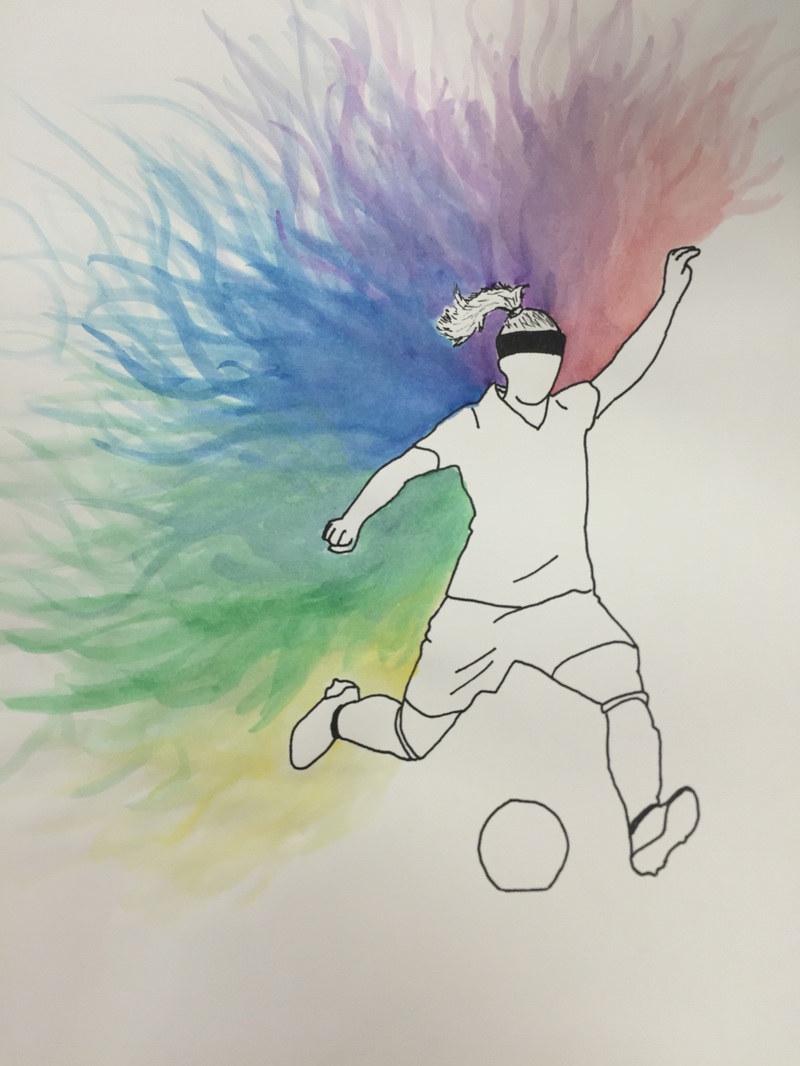  I think that ‘bloom where you’re planted’ is a very intelligent motto, because I often see people burning themselves out trying to be successful in things that they don’t even really like or have an affinity for. To me, blooming where you’re planted is excelling in what you are passionate about and/or what you’re good at. In the calligraphy skill building assignment, I learned that calligraphy is not where I will bloom. As someone with already illegible handwriting, it was quite a difficult task to try to write beautifully. I found the pen to be clumsy in my hands and I was not overtly impressed with any of the letters I was producing. However, this may have been because I have no patience and was expecting to be a master calligrapher in 15 minutes, which I know is a flawed mindset. Still, I did my best. . For the actual project, I ended up returning to a media I am familiar with and ‘blooming’ with skills that I have a talent for. My idea was to make a small little group of planets with sprouts coming out of them, accompanied by the words ‘Bloom Where You Are Planted’. To assist me in making that planets look the way I wanted, I used a tutorial from Spoon Graphics that I will summarize below:
The little sprouts I drew with the pen tool and the stars in the background I made with the symbol sprayer toul on a puckered and bloated circle. 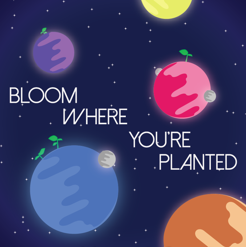  Project Title: Most Valuable Player Idea Generation: Cleats Ball Players Uniform Legs Socks A full body player Artists I Took Inspiration From: For this project I had an particular piece of art in mind that I wanted to draw inspiration from, but I could not remember the name of the piece or the artist, which left me stuck to finding other sources of inspiration. The original piece I was interested in was a photo of a hand holding an apple, with color from the apple bleeding out into the hand and the rest of the picture being desaturated. To replace it, I then looked at M.C Escher’s ‘Self-Reflecting in A Sphere’ to decide whether or not I wanted to draw or photograph my project. The intricate detail of M.C Escher’s piece was a bit of a turn-off for me because I had spent a lot of time and effort working on our original value piece, but had become bored and frustrated with it. Then, I found a few pieces by Kem5, a graffiti artist, that showed desaturated colors moving to fully saturated colors and decided to use that as the basis for my work. My Project: At first, I practice making a desaturation gradient on Photoshop with a stock photo of a Nike Cleat because I wanted to do the same to a larger picture of all of my teammates cleats, fading them in from grayscale to full color. The process went like this:
This work excellently on the stock cleat, but not so well on the aerial picture of my team’s cleats. The gradient did not show up well and the overall piece was not what I wanted. So, I made a new piece, my final piece, of me in my blazer and tie holding a soccer ball that was gradiating color into my fingers, hopefully representing the ball itself giving life to my hands. I really do feel as if I learned something from this project, both because I had to problem-solve to get a finished piece and as because I had to teach myself the entire method of making the gradient.  Dear Ms. Haggerty May, 2016
I earned an A in AP Art/Studio Art II because I really exceeded my own expectations this year. I came into class with a rough idea of what I wanted to do my concentration on and then completely blew it out of the water in terms of execution. I knew that the project I was seeing in my mind’s eye would require a professional touch and a lot of patience, and I was afraid coming in that I would be unable to complete the image I had in my head. But, somehow, I did fully generate my concept of Young Gods into an actual portfolio of art I am proud of. My skills in photography and the use of aperture, shutter speed, and exposure improved along with each shot I took. In terms of ability, I really moved beyond the realm of average with the quality of my pieces. Each of the twelve gods in the set looks distinct and crisp, especially with the added effects of my editing after the fact. When I showed you my outline of all 12 gods, I remember being a little nervous that the idea was too lofty. It’s good to know that since I started shooting in October that I managed to capture the specific facets of each theme. I was most worried about that in September, before I started, and it takes a huge weight of my chest that I was worried for nothing. That said, I did stumble in a few areas. It was very hard to actually find different people to pose for me, let alone people that fit the image of what I had in my head, and that difficulty doubled when I had to organize my schedule to be able to photograph them in the environment that I needed. And, as I’m sure you remember, I had a long streak of art block in January. It wasn’t a bad winter but it was still gray and a bit drab for artistic inspiration. But I made it out of my slump with energy! I also think that I greatly improved in other areas of more traditional art this year. I had never used charcoal or serious graphite before this class, and I’d like to think that I’ve gained at least the title of ‘amateur’. Not to mention, my sketching skills have completely transformed so that now when I want to draw something I don’t get frustrated 30 seconds in with my inability to do anything other than basic shapes. It’s nice to not feel like I’m playing catch up, and it’s even nicer to know I accomplished my goals after mulling them over for so many months in the summer before class. And the cherry on top is the big fat A in my gradebook. Riane To start, I’d would like to provide a disclaimer that I have never worked in charcoal or used a kneaded eraser, tortillon, or a graphite pencil that wasn’t a number 2. So, in doing the first project, the charcoal reduction, I had to phone Emma Murphy and beg her to explain to me how exactly to do all of it. Thankfully for me, Emma very kindly showed me what to do and I was off and running with the charcoal soon after asking her. I struggled a bit with figuring out how to get the charcoal off the kneaded eraser so that I could make the light parts of my picture, but then I realized that by actually kneading it, I could fold the charcoal into the eraser enough get a genuine light color when I used it. I also used the tortillon to fade the dyed parts of my hair into the dark parts, which I was pretty proud of, I have to say. Admittedly, I used a picture that cut off half of my face, but I have a pretty good understanding of my own abilities as a novice now, so I’m pleased with the outcome.
Now, as for the still life, I was again woefully underprepared for the intensity of the assignment. This was brought to my attention by Emma, who showed me her beautiful, multi-object masterpiece with perfect shading when all I had drawn was a beat up Converse shoe. Again, I took another hit to my ego, which (as most people know) is quite large. But it was the night before school and I was still pretty proud of how real the Converse looked (at least for my skill level). I shaded a bit, got all the little details that I usually ignore, and attempt to make the laces look layered, so it’s an improvement I think. Though I am going to be outshined by literally every other person in the class, I still surprised myself in actually being able to draw inanimate objects. |
AuthorRiane Hunt Archives
January 2016
Categories |

 RSS Feed
